buzzfeed Press
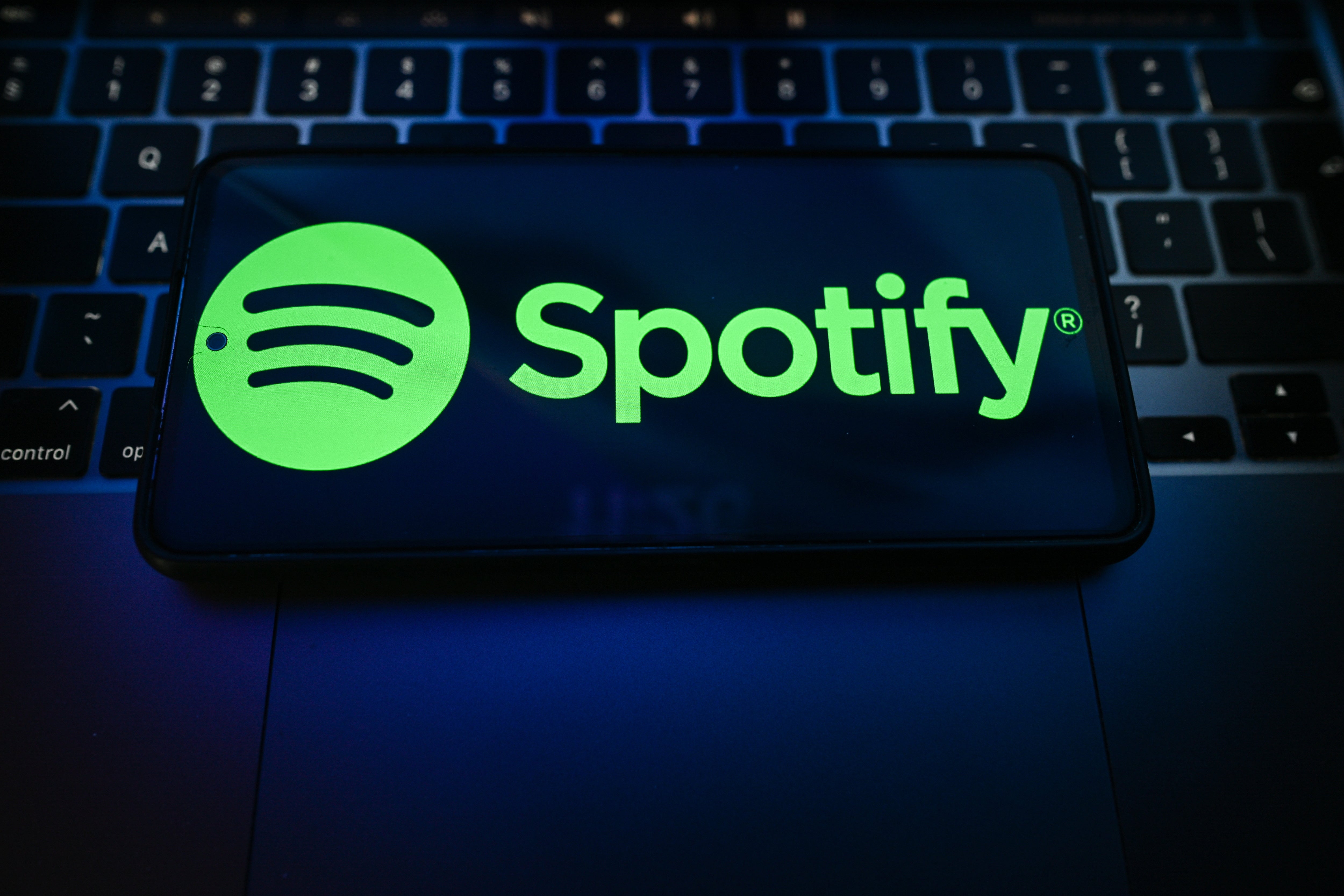
The Backlash To Spotify's Disco Ball Logo Is Conclusive Evidence That Everybody Has Gotten Far Too Comfortable Being Miserable
Images
1 / 18
2 / 18

3 / 18

4 / 18
5 / 18
6 / 18

7 / 18
8 / 18
9 / 18
10 / 18
11 / 18
12 / 18
13 / 18
14 / 18

15 / 18

16 / 18
17 / 18
18 / 18
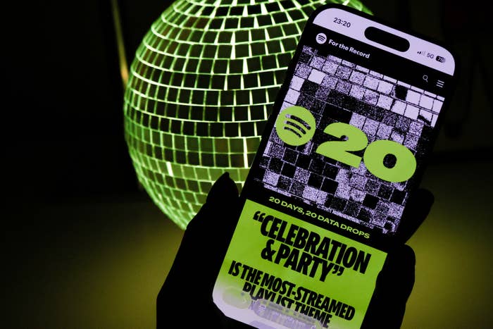
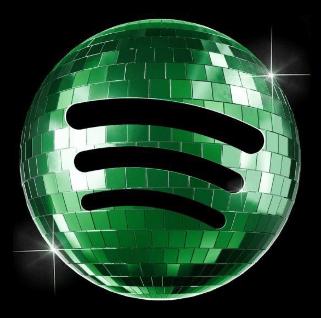
I’m an innately nosey and chronically online celebrity and pop culture journalist, with my specialist areas including deep-diving lyrics and calling out Terrible Men™.

This is one of those design / marketing moments where I just scratch my head.There are huge readability & brand issues.- Different color green- The green is too dark against the black- disco ball texture looks pixelated   on a tiny phone screenA kinda dumb mistake. pic.twitter.com/KuxZSphPgC

Whoever at Spotify thought it was a good idea to use this new logo should be fired and sent straight to prison. pic.twitter.com/Vk5DMBXD2F

people getting fired for having a little funthe reason why we have less things with unique character nowadaysfun is offensive and a nuisance to many people https://t.co/awaXPzgelq pic.twitter.com/3uF47V113h

DONT LET THE HATERS DIM YOUR SPARKLE SPOTIFY https://t.co/SjOKRfMRg4