buzzfeed Press
Every Premier League Home Kit Ranked, From Nasty To Classy
Images
1 / 20
2 / 20

3 / 20

4 / 20

5 / 20
6 / 20

7 / 20

8 / 20
9 / 20

10 / 20

11 / 20
12 / 20

13 / 20
14 / 20

15 / 20
16 / 20
17 / 20
18 / 20
19 / 20
20 / 20
Did Bruno and Gordon really leave to compete for trophies, or did they just not want to wear this kit?

We're doing home kits only because no great away kit will make up for a bad home kit.

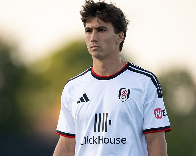
This shirt comes last not necessarily due to its pure aesthetic, which would have it far own anyway, but due to the fact that I had to check 4 times to make sure it was from this season. I assume this kit is a homage to the last 5 seasons or so of ‘plain white design’… and I guess they've done a great job of capturing that, so there's a plus.

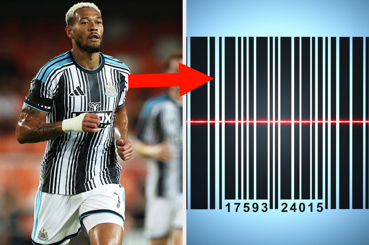
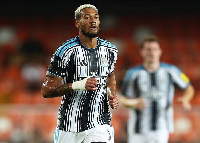
Unlike Tottenham, Newcastle have decided to make a departure from their iconic and pleasing block black and white stripes, and have apparently instead taken influence from a barcode, which may be to reflect how all of their best players were up for sale this summer. Did Bruno and Gordon really leave to compete for trophies, or did they just not want to wear this kit?

Look, we get it, you have a blue kit. There's a way of doing a nice blue kit without making it annoying, and that is not adding a random lick of yellow on the collar that looks like you've forgotten your bib when eating an overly-turmericed curry.

In fairness to City, and Puma, who have been known to make some of the most egregious kits of the 21st century, they've finally realised that neon went out of fashion. What they've instead gone for is a faded design, that is either intended to give off a ‘washed on too high a heat’ effect, or to symbolise their fade from relevance after the departure of Pep Guardiola.

It's not inventive, it's not all that interesting, but at least they've paid attention to the colour scheme. Red white a blank, pretty symmetrical, and they've also chosen a sponsor that has copied the adidas stripes, albeit in a pretty annoying way.

I'm not a fan of V-necks. There I said it. Stripes down the arm will always score some points with me because I guess I love stripes? But my major gripe with this kit is the shadowy design that makes it look like a poor attempt at some sort of same-colour dip dye.

In honour of Chelsea’s loyal home fan base, the designers have finally given them a kit that they won't look out of place playing golf in. I like that they're trying something different, but polo shirts aren't it.

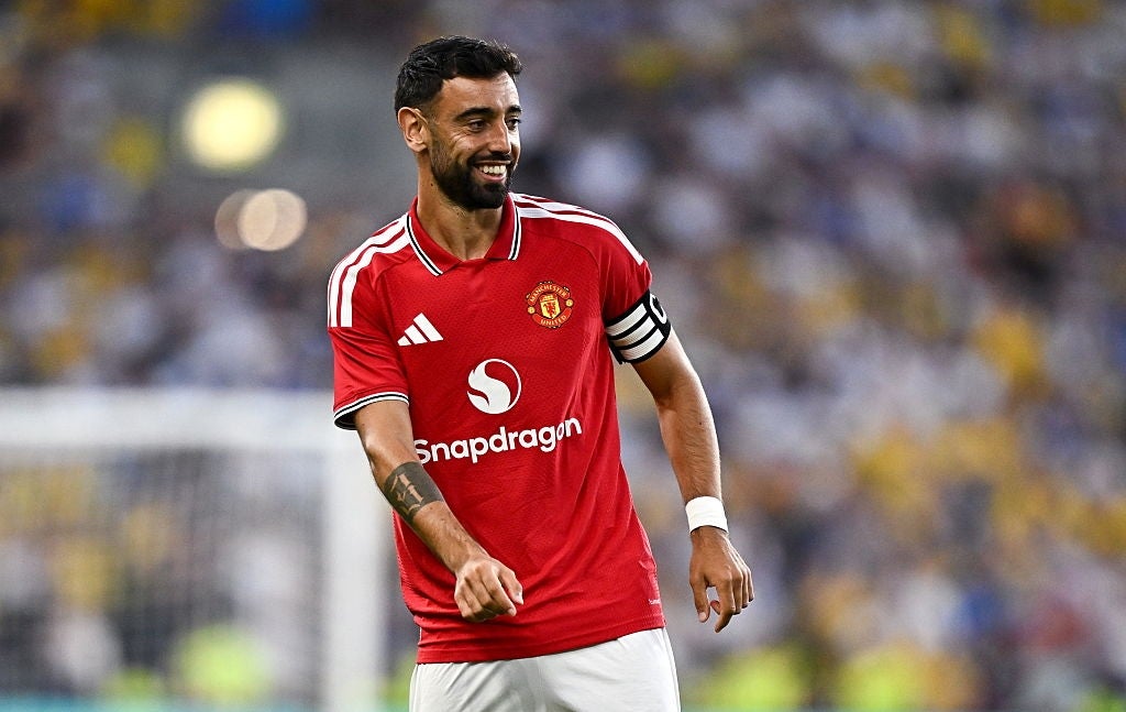
I don't hate it. There's something about a Manchester United home kit with the collar that does evoke some sort of  beautiful nostalgic hatred which I'll give them credit for; what I can't take seriously is having the word ‘Snapdragon’ across the front.

Ugh, this trend of ‘ooo let's put random chalky stripes all over our kit’ isn’t for me. It doesn't look awful but it’s just hard to take anything from it other than someone's doodles, and bad doodles at that.

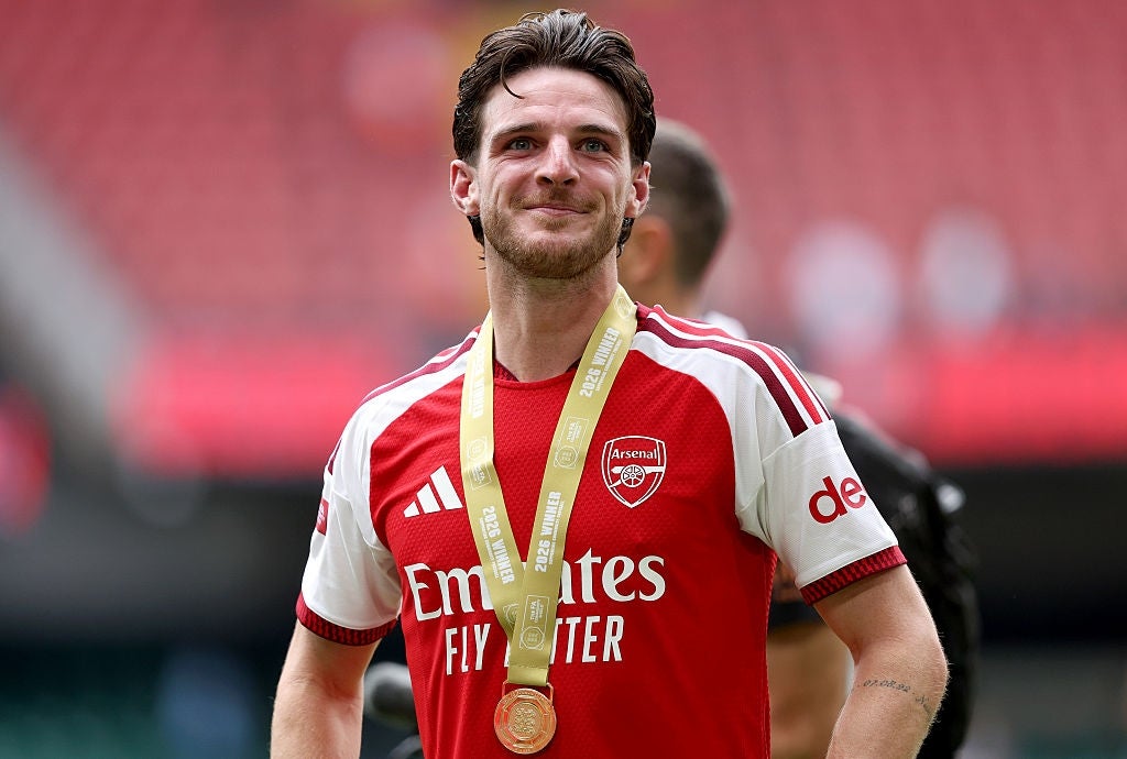
Winning the league for the first time in 22 years and they've… kept things pretty simple and exactly the same. I get it, they tried the ‘gold trim’ thing a few years back and it didn't bring them success, so why over egg the pudding? (I know the designs are probably done way before the end of the season). That being said, it's not all that interesting, but I doubt they care.

Returning to the Premier League, Ipswich have gone for a chic and slick blue on blue diamond design, and I like it. They're not getting too fancy, and the white collar and cuff gives the blue a bit more pop. It’s not the most interesting kit in the world, but who doesn't love an Umbro jersey.

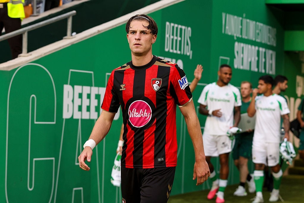
I actually like the overall kit. The dark red black and gold are a nice combo, and incorporating the sponsor like that is an inventive addition. However, the clashing pink with the red is not okay. It looks like they've got some odd pink porthole on their stomachs.

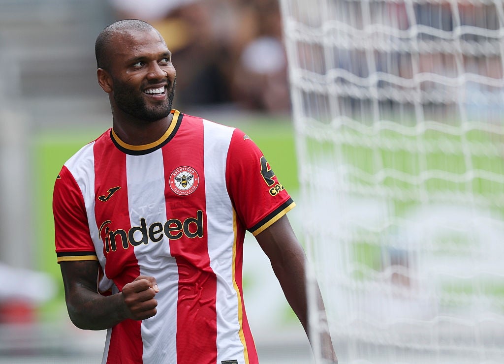
I like their commitment to the bold stripes. Bright yellow and a strong red is an ambitious combination, but I am a fan of the collar-cuff colour combo, so I'll allow it. It's a good safe kit, but their sponsor puts unnecessary pressure on the manager, because the ‘looking for a new job’ jokes write themselves.

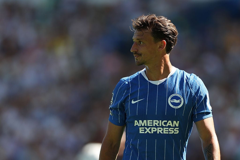
It looks like a duller blue from Brighton this year, and I'm here for it. It's a pretty simple design, but effective; my only issue is the collar, I truly don't know what's wrong with just a standard round collar, because it's better than whatever they've gone for.

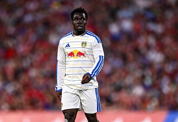
I think I'm a fan… it's hard to tell with this one. Sometimes it reminds me of one of those laminate table protectors that your parents insist on covering up the nice wooden table with to ‘protect it’, but it also seems to evoke the cold feistiness that I associate with Leeds. Also, stripes on sleeves is I guess easy plus points with me.

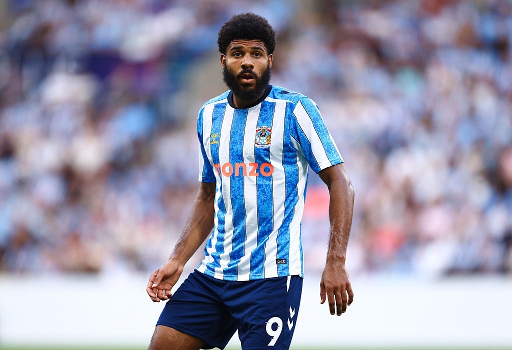
I'm not usually one of this marbley effect, but I must say Coventry have used it nicely here. The contrast with the orange Monzo is oddly satisfying, and while there's a little bit too much going on with the various badges, it kinda works.

I haven't decided if this kit would be higher or lower if their sponsor was Aquafresh, because the design seems to be inspired by toothpaste; but I oddly love it. A sash football kit will always get points from me, and I appreciate their dedication to the toothpastey colour scheme.

Just so everyone knows, I think claret and blue kits are ridiculous and a feel for all the fans of clubs that are stuck in that eyesore kit cycle. That being said, I love what Villa have done. They've muted everything, making it more classy, subtle, and simple, and I think it totally works.

Everyone’s favourites to go down, Hull have brought us a kit that wouldn't look out of place at a pub-team Sunday league game, and I absolutely love it. The simplicity, the bold stripes, the useless, buttonless collar; if they are heading back down, they'll be looking great doing so.

What's this? Stripes continuing from the shirt and going down the arms? Sign me up. The white stripe in the middle leading up to the white collar works beautifully. It's simple, it's classic, it's Sunderland, no notes.

Additional thumbnail credits: Artpartner-images / Getty Images